
The Hydrant
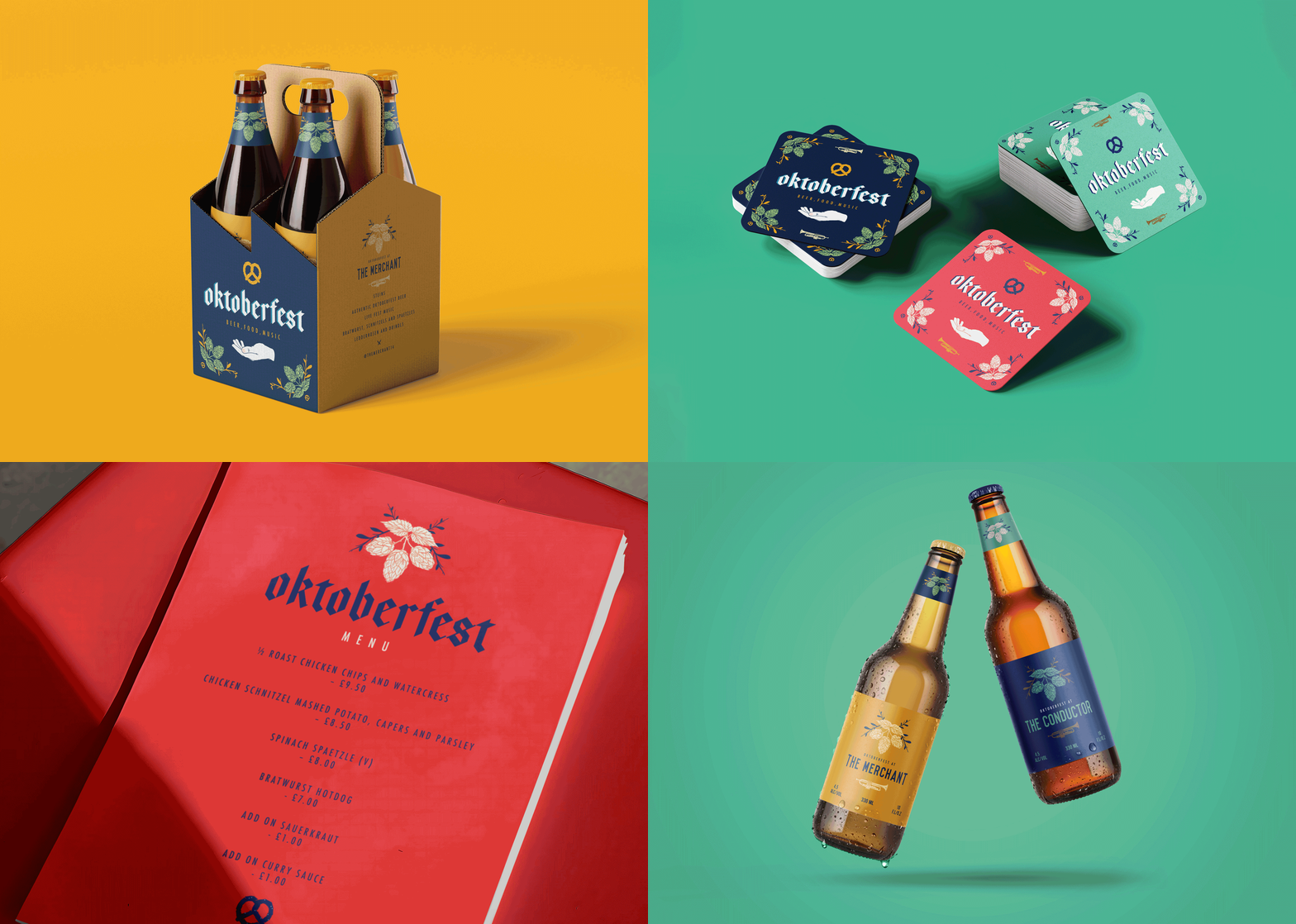
Drawing inspiration from The Hydrant’s connection to the Great Fire of London, the palette combines rich navy and vibrant red with warm golden accents. Bold and energetic, it balances the pub’s historical roots with a contemporary take on the Oktoberfest identity.


The Conductor
Developed for The Conductor, the palette takes cues from the pub’s nature-filled surroundings and the historic Great Conduit that once served the area. Soft sage greens, botanical tones and deep navy create a calm, organic identity that connects landscape and local history with a distinctive interpretation of the event brand.


The Merchant
Inspired by The Merchant’s location in Canary Wharf and the area’s rich maritime history, deep nautical blues are paired with warm ochre tones. Referencing trade routes, merchant vessels and the working docks that once defined the waterfront, the palette brings heritage and character to the celebration.